September 29, 2009

Castle

One of the hazards of being so busy these days, is that the house is a mess. Hence, our daughter is being watched by her grandmother today so we can try to at least attempt to get our home in order! It's amazing how much stuff you accumulate, isn't it?

Since we moved into our current home, our bedroom has become a bit of a catch-all of all stuff that doesn't really have a home. Therefore it's an absolute disaster and not to mention absolutely embarrassing! There is STUFF everywhere! Not to mention a few boxes we haven't unpacked yet. Scary considering we moved in 8 months ago!

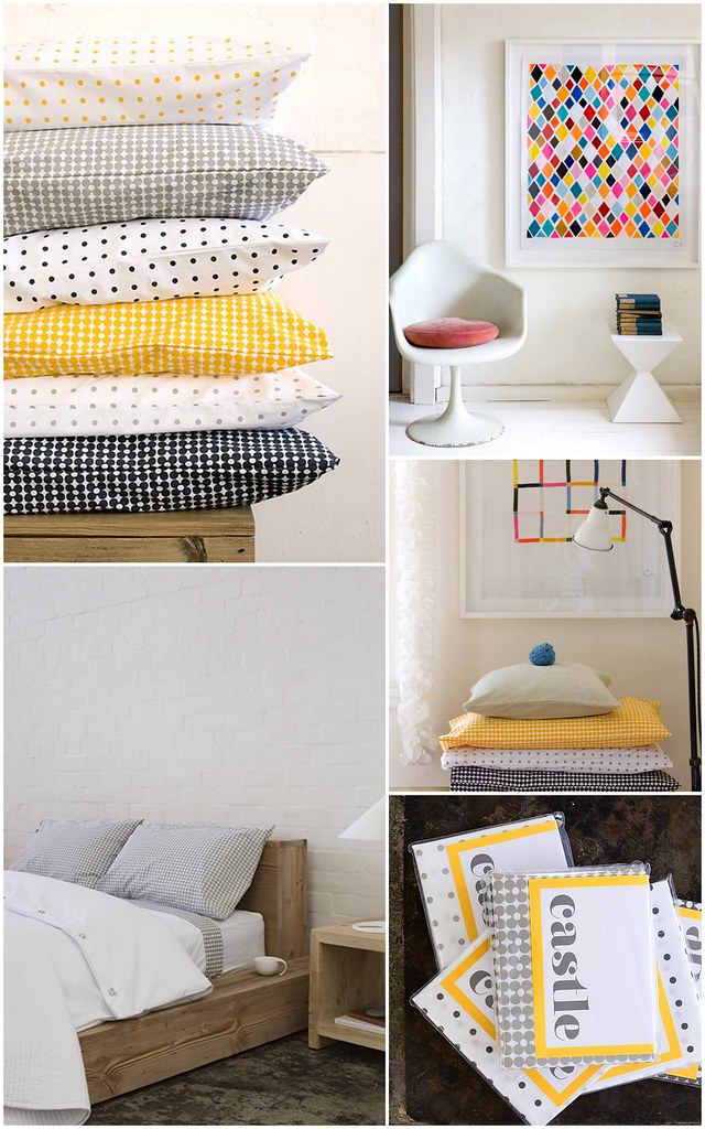
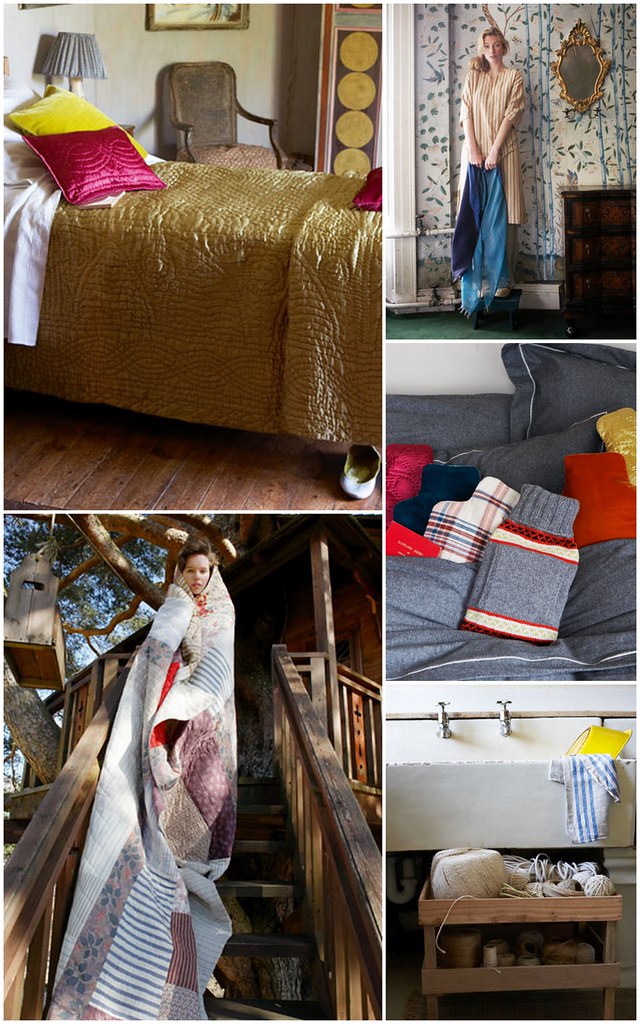
I love the awesome grey in our room, and I even went out and bought a new duvet cover yesterday to better complement it. On my search for new bedding, I remember an Australian company that I had bookmarked. Enter Castle.


all images from Castle


Founded in 2008 by Rachel Castle beginning with a small line of bed linen's for friend's and family, it soon became her full time job. I love the fact that all the fabrics at Castle are predominately handcrafted or hand printed.


all images from Castle


The gorgeous embroidery and art prints that are offered and created by Rachel herself, as well as her mom! That is so sweet!

I'd like to start a discussion, I was wondering, is there a particular shop that you all tend to gravitate to for all your bed linens? Or do you like to mix and match? Are discount stores your thing? Where do you buy your premium linens?

September 28, 2009

Ask Me! follow up.....

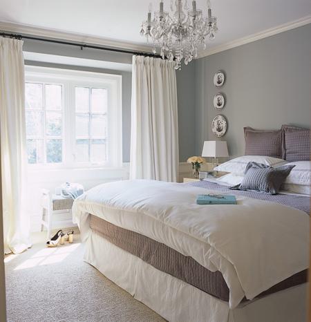
Upon surfing through a few sites and blogs this morning, and in reference to last week's Ask Me post, I found the awesome photo gallery of Grey rooms. Here are a couple of my favorite's below, and to see the full gallery, click here!


all images from Canadian House and Home


This just goes to show you that grey doesn't have to be drab and boring...all you have to do is add some colour and some sparkle and shine, and voila! Pure Beauty!


September 25, 2009

TGIF!

So, how was everyone's week? Mine was fab-u-lous! I got sooo much accomplished this week, more than I had expected. Did you do the same?

The weather here in the city that I leave is supposed to be quite gloomy over the next few days - again - therefore I plan on being at the mall as much as I can, Addy doesn't like to be inside for more that 1 day it seems. :-)

I thought I'd leave you with some awesome "things" to browse over the weekend, just a small collection of sites and shops that I'm keeping my eye on.

The Visual Notes blog .....


Art Project, 20 x 200 .....


Swedish bloggers, Dos Family .....


Etsy seller, An Artful Agenda .....


free card download, from Hey Susy .....


Happy Friday, have a fantastic weekend, and we'll see you all back here on Monday!

September 24, 2009

Northern Exposure {Ask Me!}

This weeks question comes from Cate. Her home has northern exposure thus resulting in a really dark space, hence she is looking to lighten up her home with some great paint selections and accessories.

"I need help! Our condo is warm warm warm - brown on brown on brown. How do you cool down a warm space? We are looking to paint and thought that adding some grey to the paint colour would help, but we've gone too far to the grey spectrum and it's not complementary. What do you suggest? What is a warmer side of cool grey/brown?
We have northern exposure and it's just too dark. We want to lighten the entire place up. Our major purchase furniture-wise is a charcoal grey sofa, which is why we need to lighten and cool I think. I'm all for accessories, however, I want the paint colour to be neutral."
-DecorAddict reader Cate

Now, Cate has filled me in on their colour choices thus far, the only one she, and I are enjoying is Gray Mist from Benjamin Moore.


This gray is so subtle, so light, very airy, it is in the white family of the BM colour swatch selections. It's light enough so that you won't get that blah feeling, and dark enough to cool down the space.


Now Cate, you have mentioned that you face north, which of course means not very much light, creating a very dark space. Normally, in the decorating world, the last colour that would be recommended to you would be a cool tone, since this tends to darken the space even further. Gray Mist is definitely a cool tone of gray. You could still use this, but I would use accessories to brighten up the space. Here are a couple of suggestions below.


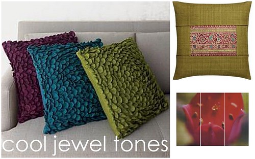
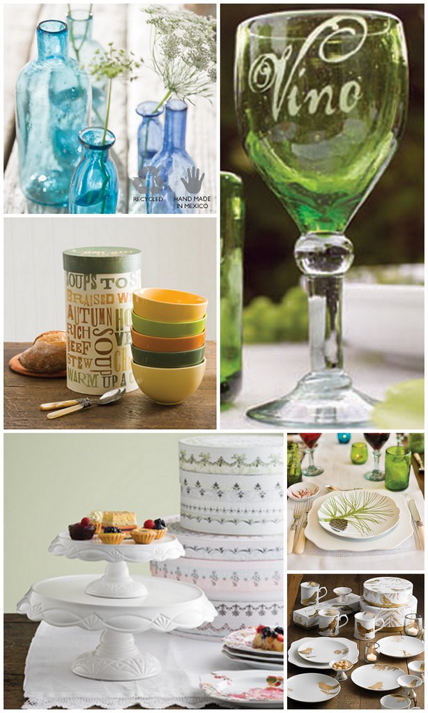
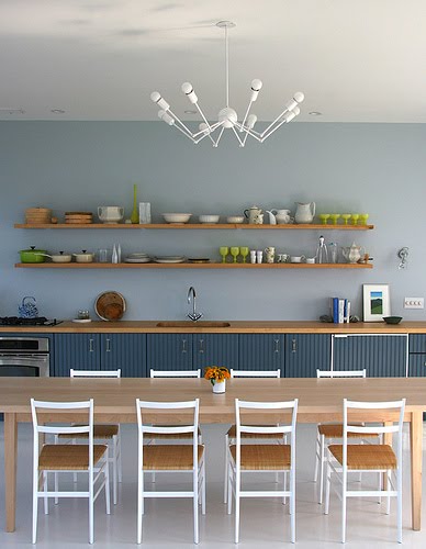
You did say that you were not a fan of red and red tones, since it gives off a warm vibe, so for accessories I would suggest some jewel tones such as purple, green, and teal blue.

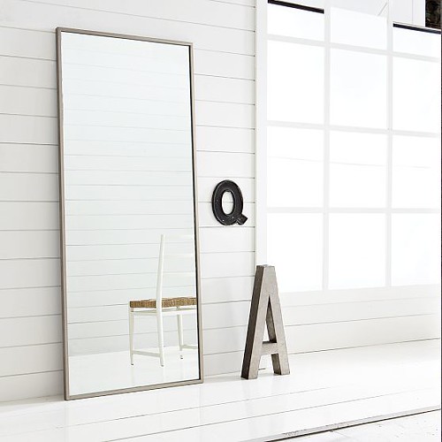
Another way to brighten up a dark space is by using a large mirror, either on the floor, or mounted on a wall. This works really well especially in close proximity to a window. This will brighten up a space and will make it feel larger.


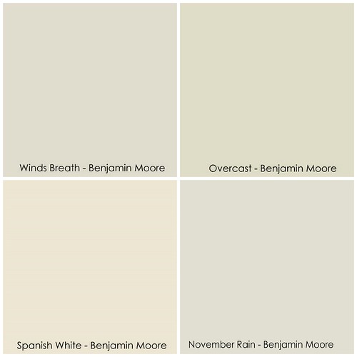
Another option would be to use a slightly warmer tone of grey, sticking with the Benjamin Moore family, you could go with Winds Breath, Spanish White, Overcast (slight green tone), or November Rain.


Cate, I hope these suggestions have helped you out!

Do you have a decorating question for DecorAddict? If so, email me, and I will do my best to help you out!

Have a great day everyone!

September 23, 2009

RedLetter & Rosanna

I was celebrity stalking in Yorkville the other day during TIFF, and stumbled upon an awesome gift ware store, RedLetter. In fact I picked up my own Keep Calm and Carry On poster (finally!).


images by DecorAddict

You can visit Red Letter in Toronto to pick up your own Keep Calm poster (in red only), or you can visit Sfgirybybay to pick up one in numerous colours by clicking here.


One of the gift/housewares lines that is carried at RedLetter is Rosanna. There are some absolutely beautiful collections in this line, here are some of my favorites below.

all images from Rosanna Inc.


Now, I don't think RedLetter carries all of Rosanna's lines at the Toronto Yorkville store, if not, you can always contact Rosanna directly to find out where you can get your hands on their other products.

On a totally unrelated note, it's a really gloomy day here where I live. We've had close to 3 weeks of beautiful weather, but the last 3 have just been totally gloomy, not to mention really humid and sticky. NOT my idea of a nice day. I think today I'm going to venture out this afternoon to run a few errands, and pick up some things for dinner since my mother in law is getting her Addy fix today.

Happy HUMP day! :-)

September 22, 2009

Style At Home {makeover contest 2009}

I really should have posted about this a few weeks ago, but thanks to my having very painful kidney stone attacks last week, I'm so behind! I'm so sorry everyone!

For all of DecorAddict's reader's in Canada, you have only 2 days left to submit your spaces to the Style at Home Makeover contest for 2009!


You can find all the details here. Thank you so much to Natalie over at Style at Home for reminding me about this! Did you know that Natalie has a blog over at Style at Home as well? It's one of my new addictions! You can visit her blog, Favorite Things over at Style at Home by clicking here.

Everyone MUST submit their home makeover projects, you will not believe the prizes, there are 2 $2000 Home Depot gift cards to be won! WOW!

Splurge Lighting

Gorgeous handmade pendant lighting from Etsy seller Splurge.....


all images from Splurge


See the full selection here.

September 21, 2009

StyleGarage Sample Sale coming soon!


For all you Torontonians, StyleGarage is having their annual sample sale! Find all the details here, or here.

Future Kitchen Thoughts

Every family has a goal of one day buying a house, don't they? We're starting to poke around, looking for a deal, as you never know when that perfect house will pop out of no where.

.....a fixer-upper would be ok with us.....


We're looking for a house with good bones, one that will not only fit the 3 of us, but with room for extended family as well. That's the tricky part, thankfully, we're not in any rush.

What I'm most looking forward to in buying a house, is that it will have to be a house with a big kitchen. I'm not one willing to tear down walls or anything, however I do want a kitchen that needs to be gutted and redone, so that I can put our personal touch on it.

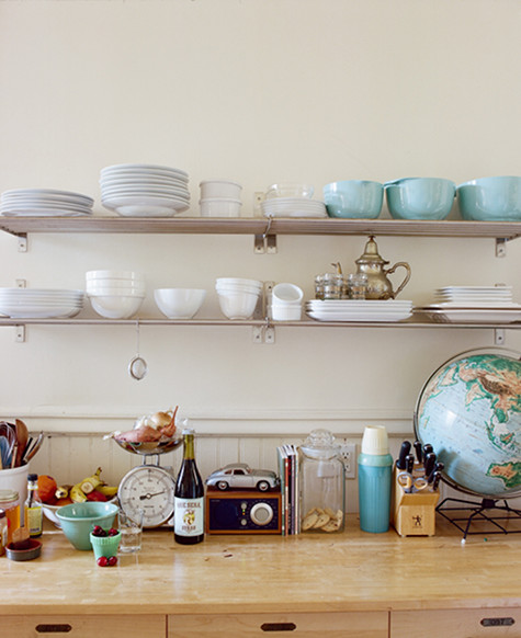
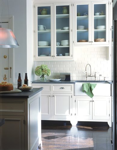
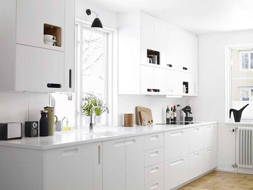
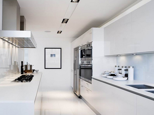
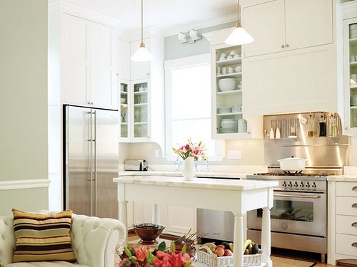
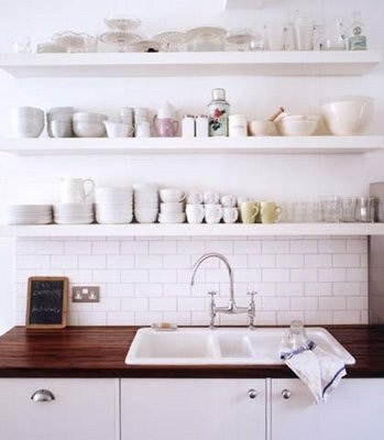
I've started to collect photos of some kitchen's that I like in my inspiration folder. Here are some of my favorites so far.


Have you noticed that I'm going for a very European look? I really like the look of having open shelving, or no shelving at all above the counter. What do you think of this look?

I also have a tendency to love all white kitchens. I'm not sure why, I probably associate white with clean....which is what every kitchen should be like.


honky.co.uk


unknown source

What types of kitchens are you most drawn too? Do you like the traditional upper and lower cabinets? Or are you too loving the openness that no uppers provide?

September 16, 2009

West Elm Sale Alert!

I know I said I'd be absent for the remainder of the week, but I just couldn't resist sharing this with you.

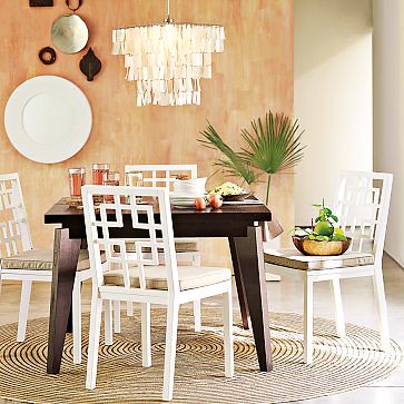
Look at this gorgeous Capiz Pendant! It's on sale at West Elm for only usd$89.99!


You can buy it here, and see more of their sale item's here.

It's it scrumptious?


all images from West Elm

September 15, 2009

out of the office .....

Good Afternoon everyone,

So sorry I've been mostly absent this week, however I've been a bit under the weather. I've decided that I should remain quiet here on DecorAddict for the remainder of the week to get back to normal.

I'll be back online this Monday, September 21st with lots of new goodies for everyone!

Have a great week!

Trina
xoxo

September 11, 2009

Must Have!

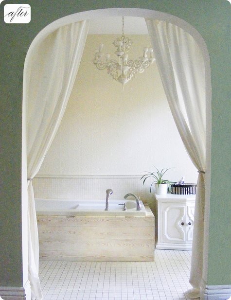
LOOK at this bathtub. LOOK AT IT!!! OMG!!!

Truly dreamy.


photo from design*sponge


See the before/after story over at Design*Sponge

September 10, 2009

Defining Spaces {Ask Me !}

Does everyone remember this post from last week? Well, I've already received a few emails from readers with some really good questions.

This week, I'd like to talk about a very common issue that alot of people face, that's a shared living and dining space. There are so many homes and condos being built right now that offer open concept spaces, the dilemma of distinguishing the spaces is often an issue.

DecorAddict reader Megan has this exact same problem. Her living room and dining room are essentially one large room, the only this separating them is a small built-in shelving unit. Although this does seem to separate the space enough as it is, there is more that you can do to expand on this idea.
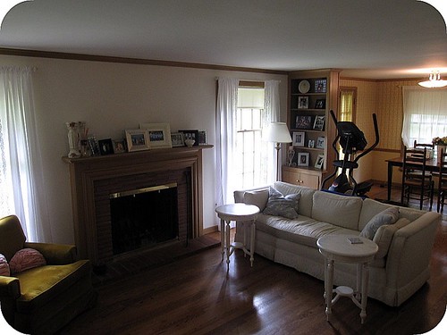
reader photo


The most obvious is to paint the dining room are and living area 2 different colours. Now you don't necessarily have to go to the extreme and paint them completely different, you can even use the same colour, and just use a different tone to separate the spaces. Doing this won't seem as harsh either. Here are a few examples:


Pick all of your colours for your space from 1 paint chip. They are all related, so you know they all go together.
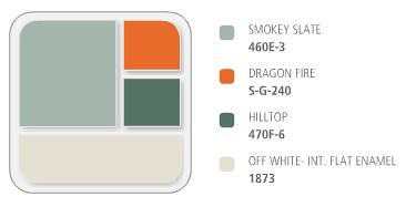
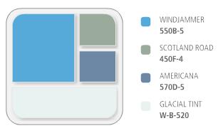


Behr paints has software both online at your local home improvement centre that will coordinate colours for you. I can spend hours on their website playing around with different combinations.


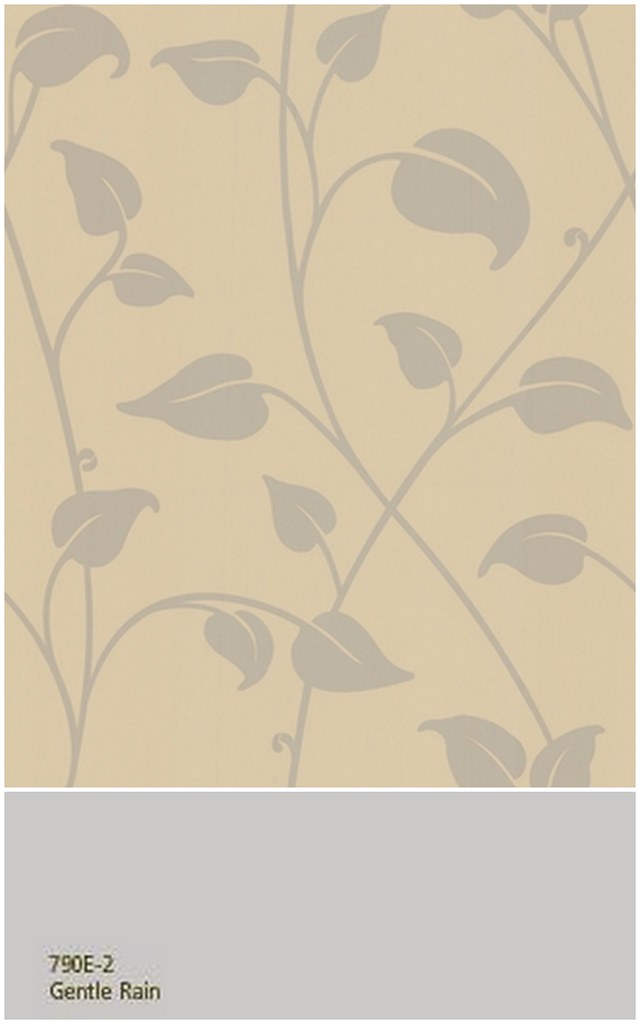
The other think you could do is to wallpaper the dining area and not paint at all. You could pick a pattern that complements both rooms, and in a colour that would compliment the paint colour in the living room. Dining rooms are great to play with wallpapers, as you can use something really dramatic to play up the space, or something really simple and subtle, one with more of a texture rather than a pattern.

wallpaper, Graham & Brown; paint, Behr


wallpaper, Graham & Brown; paint, Behr


And finally, you don't even have to use the walls to distinguish the space at all if you don't want too, you can use area rugs to do this. Now, I would pick 2 rugs that were the complete opposite of one another, but I would pick either the same carpet, in the appropriate sizes, or similar colours. You are dealing with one room, and one style, so don't go too nuts.

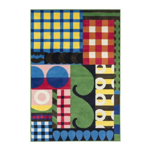
This rug from Ikea comes in 2 sizes, 140cm x 200cm, and 170cm x 240cm.


Or, you could pick 2 or more rugs that are similar, or from the same collection or designer, this way even though they are not alike per-se, the will have the same feel, or style. Take these 2 rugs from Ikea below for example....


Megan, I hope this helps you out! Please let us all know what you end up doing with your space! We'd love to see some of the after shots once your all finished!

Do you have a decorating question for DecorAddict? If so, email me, and I will do my very best to help you out!

September 9, 2009

TOAST, Fall '09

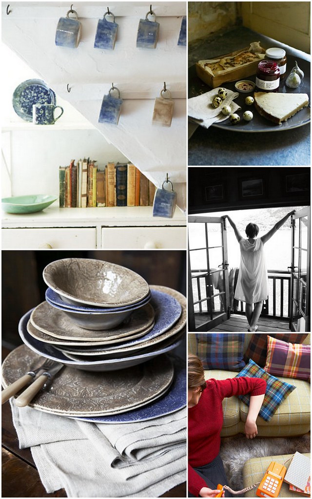
No words are necessary. The Photography speaks for itself.

To buy any of these item's from Toast, click here.


all images from toast

September 8, 2009

N.E.E.T. Magazine

With many mainstream shelter magazines falling apart, independent webzines are beginning to pop up everywhere.

Although it's not new at all, enter N.E.E.T. Magazine. The brainchild of Stephanie J, based in the UK, everything in the magazine is handpicked, designed and organised by her, the editor.


N.E.E.T. began in December 2005 publishing online 4 times per year. Visually, she still used the traditional magazine format, however the contents were much different. Catering to, and showcasing independent grassroots creativity, it was the first of it's kind.


N.E.E.T. accepts contributions from independent shop owners, photographers, illustrators, writers, and even fashionistas. You can find out more about contributing here.


all images from N.E.E.T. magazine