This week, I'd like to talk about a very common issue that alot of people face, that's a shared living and dining space. There are so many homes and condos being built right now that offer open concept spaces, the dilemma of distinguishing the spaces is often an issue.
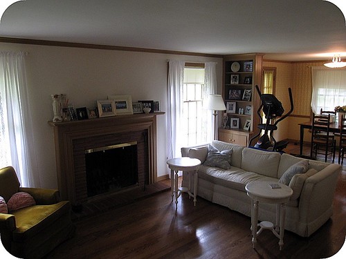
DecorAddict reader Megan has this exact same problem. Her living room and dining room are essentially one large room, the only this separating them is a small built-in shelving unit. Although this does seem to separate the space enough as it is, there is more that you can do to expand on this idea.
The most obvious is to paint the dining room are and living area 2 different colours. Now you don't necessarily have to go to the extreme and paint them completely different, you can even use the same colour, and just use a different tone to separate the spaces. Doing this won't seem as harsh either. Here are a few examples:

Pick all of your colours for your space from 1 paint chip. They are all related, so you know they all go together.
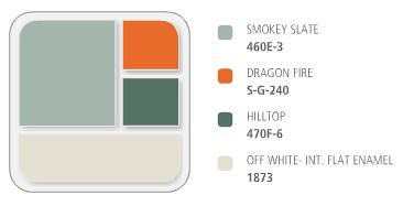
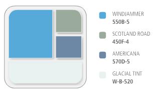
Behr paints has software both online at your local home improvement centre that will coordinate colours for you. I can spend hours on their website playing around with different combinations.
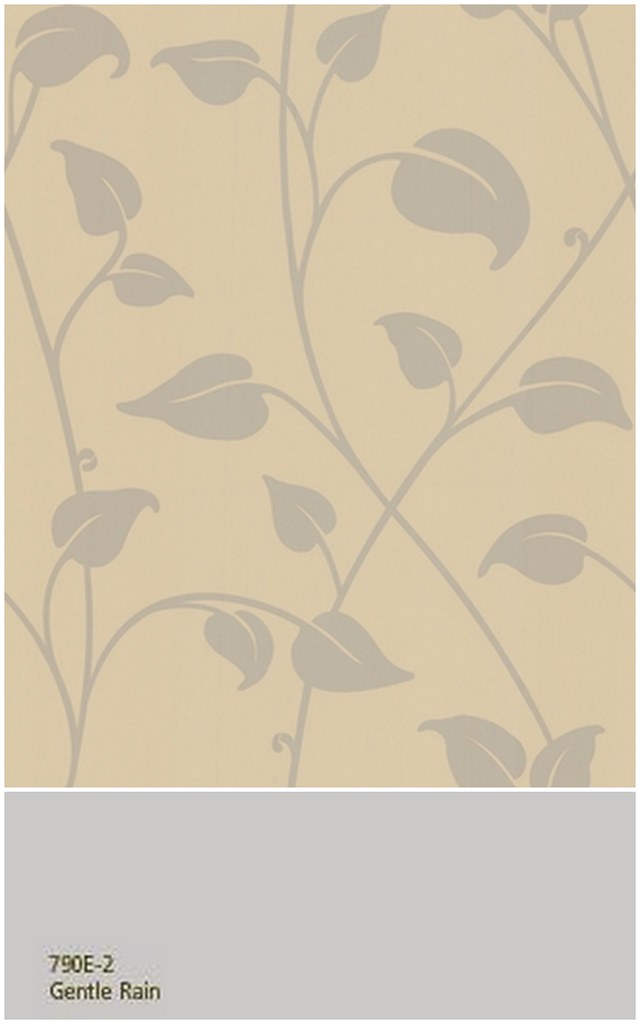
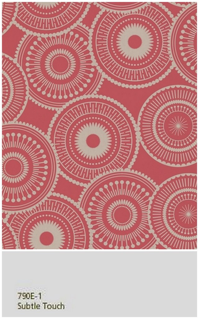
The other think you could do is to wallpaper the dining area and not paint at all. You could pick a pattern that complements both rooms, and in a colour that would compliment the paint colour in the living room. Dining rooms are great to play with wallpapers, as you can use something really dramatic to play up the space, or something really simple and subtle, one with more of a texture rather than a pattern.
And finally, you don't even have to use the walls to distinguish the space at all if you don't want too, you can use area rugs to do this. Now, I would pick 2 rugs that were the complete opposite of one another, but I would pick either the same carpet, in the appropriate sizes, or similar colours. You are dealing with one room, and one style, so don't go too nuts.
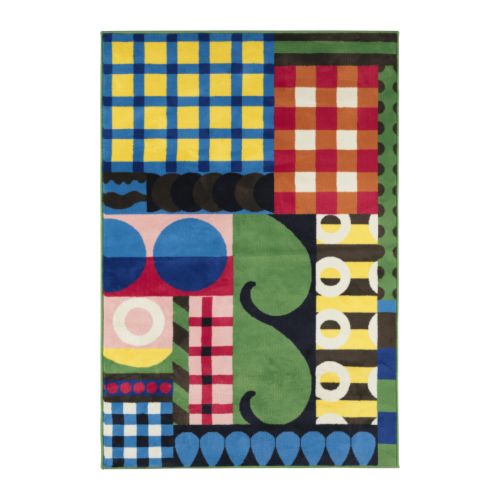
This rug from Ikea comes in 2 sizes, 140cm x 200cm, and 170cm x 240cm.

Or, you could pick 2 or more rugs that are similar, or from the same collection or designer, this way even though they are not alike per-se, the will have the same feel, or style. Take these 2 rugs from Ikea below for example....

Megan, I hope this helps you out! Please let us all know what you end up doing with your space! We'd love to see some of the after shots once your all finished!
Do you have a decorating question for DecorAddict? If so, email me, and I will do my very best to help you out!

3 comments:
This is amazing! Thank you so much for the detailed thoughts and advice. I think I'm leaning towards doing two colors of paint - but using the same tone. I love the examples you provided. Very pretty.
I just want to note that the photo is of the current condition and the seller's stuff. We move in 2 weeks from today and will get started then putting these thoughts into action! We're starting from scratch (need furniture, paint, etc)- so should be fun!
I will definately send an updated photo once we get some work done.
Thank you so much again!
Megan
P.S. Love that Ikea rug...love!
Wallpapers often overwhelm a room with repeating patterns, but these look very elegant. The sets are also great ideas.
Nicolette
http://www.furnitureanddesignideas.com/
We have a shared living and dining area too, so thank you for the advice. Anyway I just recently painted my living-dining room. Probably next year or something when I am bored with the color I have now then I can try one of the tips you gave here. :-)
PS. I saw the colourful rugs when I went to Ikea last time too and really really loved them!!
Post a Comment