
A few years ago I painted my bedroom “Lavender Sparkle”, by Behr Paints. The following January, that exact color was feature in Canadian House & Home magazine as THE color for the bedroom. Hmmm. Could I predict the colors of the future I thought?
Nah, that was just a total fluke.
This year, Canadian House and Home has listed their “23 fresh paints” in the annual trend issue (January, 2010), and I can honestly say, I’m not a fan this year. I’m not sure what it is, but it seems like the magazine, or maybe designers are playing it safe this year. Nothing is really jumping out at me saying, “now that’s original!”. Everything seems like it’s been don’t before, and none of these colors speak to me like they have in past issues.
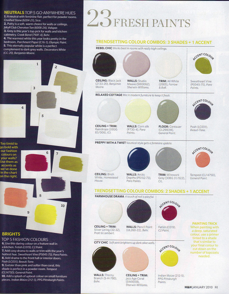 image scanned from January 2010 Canadian House & Home
 Thankfully, Canadian House & Home has a WICKED, and I mean WICKED online photo gallery of various homes, rooms inspirations what have you. Here is a snippet of colors that I AM feeling right now, courtesy of H&H.
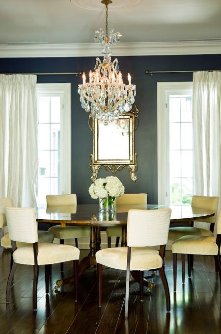 Charcoal Grey: I am absolutely feeling almost all the greys right now, most especially charcoal. It ad's such a dramatic feel to almost any room, yet it's calming at the same time. This grey surely is NOT depressing, unlike some greys of the past.
 Chocolate Brown with Turquoise: This colour combination has been a favorite of mine since I was a little girl; my grandmother sewed a brown velvet skirt for me, and in the underside of the hem was turquoise hemming tape. I wanted her to put the turquoise tape on the outside of the shirt because I loved it so much.
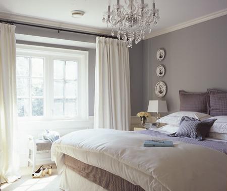 Greige: Self explanatory. See this post for the full explanation.
 Whites: You can't loose with white walls, but what really makes it interesting is your accessories. ALWAYS ALWAYS ALWAYS punch it up with some brights, these yellows, purples, and blues are a great example.
 Intensity: It's not the colours used in this photo, but the contrast of strong hues used on this staircase and the accompanying walls. Yummy.
 Deep Blues: I have always been a fan of blue, but this intense Mediterranean blue calls to me. It reminds of a trip to Greece over 10 years ago; this is the colour of the Mediterranean.
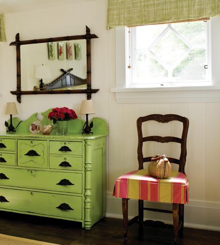 Celery Green: This is such a fresh colour, and reminds me of my grandmothers house. I'm not quite sure why, I think her kitchen chairs had green vinyl seats much like this shade.
Do you have a favorite color, or color combination that is calling your name this season? I'd love to see some comments below on this topic. We can all use some inspiration from our fellow readers, right?
all images above from Canadian House & Home
3 comments:
I really like the top row of paint combinations-rebel chic, but I do agree with you in that I also think the designers are playing it safe this year. I am happy that the Pantone colour of the year is turquoise. One of my fave colours of all time.
I clearly don't spend enough time with paint - greige?! Oh how I wish I'd known how fabulous a colour that was before painting my living/dining area plain old beige!
I LOVE the blue dinning room...
Post a Comment