
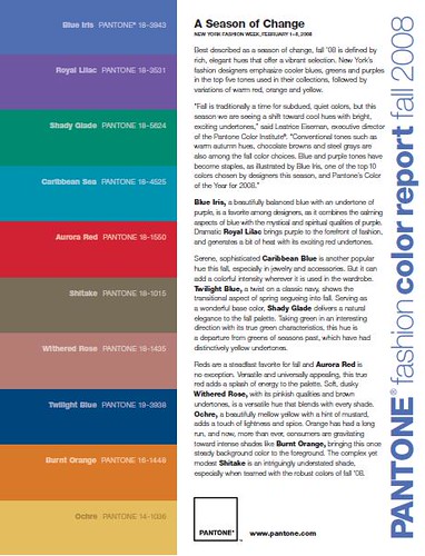
My personal favorite's are all the blue's and green's, with a little bit of purple thrown in for some SPLASH! I do promise to showcase some of my favorite room's showcasing these amazing colour's shortly, when I'm not covered in a535.
I'm not a big fan of the orange, but used in the right context, this would make a fantastic accent colour.

Pantone also just released their Spring '09 colour forecast, fellow blogger EyeSpy blogged about this already, she did a fantastic job, make sure you check her post, part 1 here, and part 2 here
Enjoy!
2 comments:
Ha, I'm always amazed when this happens. We posted about the same thing on the same day-small universe!! I find those Pantone colors a bit too bright-I prefer more muted versions. Found you through Decor8blog. Nice to meet you!
Hi Rita! Nice to meet you too!
Great mind's think alike!
T
Post a Comment