
"I need help! Our condo is warm warm warm - brown on brown on brown. How do you cool down a warm space? We are looking to paint and thought that adding some grey to the paint colour would help, but we've gone too far to the grey spectrum and it's not complementary. What do you suggest? What is a warmer side of cool grey/brown?
We have northern exposure and it's just too dark. We want to lighten the entire place up. Our major purchase furniture-wise is a charcoal grey sofa, which is why we need to lighten and cool I think. I'm all for accessories, however, I want the paint colour to be neutral."
-DecorAddict reader Cate
Now, Cate has filled me in on their colour choices thus far, the only one she, and I are enjoying is Gray Mist from Benjamin Moore.

This gray is so subtle, so light, very airy, it is in the white family of the BM colour swatch selections. It's light enough so that you won't get that blah feeling, and dark enough to cool down the space.
Now Cate, you have mentioned that you face north, which of course means not very much light, creating a very dark space. Normally, in the decorating world, the last colour that would be recommended to you would be a cool tone, since this tends to darken the space even further. Gray Mist is definitely a cool tone of gray. You could still use this, but I would use accessories to brighten up the space. Here are a couple of suggestions below.
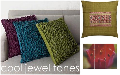
You did say that you were not a fan of red and red tones, since it gives off a warm vibe, so for accessories I would suggest some jewel tones such as purple, green, and teal blue.
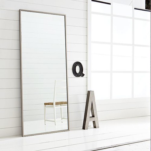
Another way to brighten up a dark space is by using a large mirror, either on the floor, or mounted on a wall. This works really well especially in close proximity to a window. This will brighten up a space and will make it feel larger.
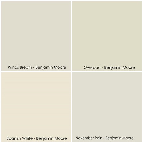
Another option would be to use a slightly warmer tone of grey, sticking with the Benjamin Moore family, you could go with Winds Breath, Spanish White, Overcast (slight green tone), or November Rain.
Cate, I hope these suggestions have helped you out!
Do you have a decorating question for DecorAddict? If so, email me, and I will do my best to help you out!
Have a great day everyone!
1 comment:
I never much liked the grays, but I'm beginning to warm up to them. :)
Post a Comment